


Lily Warnes Evaluation.
In many ways our media final piece has been involved in trying to challenge the forms and conventions, for example we tried to create our final piece into a more effective music video by adding in effects in final cut to improve the viewing, such as the writing that appears to adapt on the lyrics in the song and where the main band music appears in the centre of the song we split the screen so that it changes with the beat. Both of these were very effective in our project, and we were given good feed back for these new effects as it gave the audience something that would keep them watching. Having these features in our main media project really adapts our music video into what could be a real music video as it does stay featured on the one artist and character, it also is kept in genre with our music video, Indie.
The ancillary tasks are represented as quite real media products as we used the workshop of photoshop to adapt and improve the photos we had of Charlie and kept in theme with the video. We used a technique called 'posterising' that made the work look much more official. The text on the work also looked proffesional as we choose a standard style that suited our work.
Over all our final products all had the features and effects that could challenge the idea of real media related products.
How effective is the combination of your main product and ancilliary texts?
I found that both our music video and ancillary tasks we made were formed so that they all fitted into the same genre, Indie. We created the final products to have the similar effects, for example i mentioned before the image distortion and the use of photoshop to create a more unique style. During the creation of our ancillary tasks we used photoshop and screen grabbed some images from our final cut project just so we could enhance our image collection and make it more realistic to official media products.
What have you learnt from your audience feedback?
Without having peer and audience feedback we wouldnt of been able to create and modify our final piece to the standards of our audience. We were aiming for the teen age range so by reacting to the criticisms and working on our plus's to our advantage we were able to modify our music video. A few examples of criticisms we recieved were mainly that we needed to add more into our music video and give it something more special so that it stands out, and can keep the audience interested.
How did you use new media technologies in the construction and research, planning and evaluation stages?
Through out the creation of our media products we used many new technologies that were able to help us advance in our forming of the final product. We used many computer related products; such as the world wide web we used this to research related videos on the web by using such sites as youtube. We also used the internet base of Google to find ideas for our ancillary tasks as we looked for images and other band covers. We had the availability of using many media realted products to help us in the making of our work, for instance the use of final cut to edit the music video together and photoshop to expand our digi pak style.
Sunday, 13 December 2009
Charles Littlefair Evaluation
The conventions of an indie music video are having a band performance going on throughout the video and some sought of narrative or un-music related story. As a group we decided to stick to this so that our piece would look more like a real media product. Our first idea was having the band performance in a field but the weather stopped us from doing this on various occasions so in the end we filmed our band playing in a music/production room. Our narrative was having the main character and lead singer walking down different roads singing the song and relating to the song. This challenged forms of indie music videos because our band had both genders within in whereas most bands at this time are predominately male. When filming the band, we wanted to make sure we had lots of shots to cut to and from as I believe that all good music videos have lots of shots and shot types. We also did the same when filming down the streets so we would film the song once then we would do it 4 more times at different angles or different distances.
By keeping with the one theme of Indie we developed this within in the facial expression, costume, and attitude and also within the editing. In many indie video different affects are used. So from peer feedback we were told there were parts of our piece that lacked something and were slightly boring. So we decided to add in the splitting screens. This had a very strong relationship with the music as the scene multiplied with the beat of the music.
This made our music video more eye-catching and gave the viewer more to watch. We also added text to points in the video where there were areas of dull open background. This also gave the viewer something else to watch and is used in other music videos of similar style.
We were able to put these affects in because we were using Final Cut Express, a good piece of new technology. The affects it gave us were the spilt screening, text, changes of pace and general cutting of the video. It also helped us to get the lip syncing correct as me used markers to get it exactly right. I believe that it improved our music video greatly. But to further improve it I think a better model of camera would do a great deal.
I think that to make a good music video and to make it look like a real media product you need to use lots of shots and the shots need to be changing frequently throughout the video. This is a key point that we tried to follow whilst filming and editing. Also the costume that the lead singer and band is wearing is important. So we made the lead singer have indie clothes on and change them for every shot. So then the indie audience could relate to the video.
2. How effective is the combination of your main product and ancillary tasks?
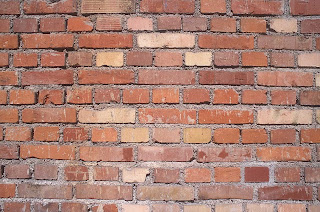
This is my magazine advert I wanted to make it looks as professional as possible. The way I did this was to add logo at the bottom, have a simple but bold font, a website featured and to edit the piece a lot so it looked unnatural. I did this by using a programme called Photoshop, separating the background and foreground and using an effect called posterisation. This also makes it a lot more eye-catching. The way this is linked to the main piece is that it is the main singer in the picture and the also there are parts of the music that would be classed as abstract and so is this with the multi-coloured bricks.
This is the DVD DigiPak we wanted to make the two products linked so on the front the background is posterised and on the back the main is poster and the background is natural. Also we used to same font on both pieces. We also added the logos on the back of this one to make it look real. On the back we put screen shots this gives the audience a look at what is on the DVD. As there is bad language in this song we put a 15 certificate on the front and back to warn parents of bad language and also we put a parental advisory on the digipak.
The three products make a promotional package this is why they are linked together. In the music video the lead singer is seen as a cool, popular and bold person so in the photos we kept this theme with the main character not smiling but knowing that the camera is there. We decided to take pictures again as the screen shots, when enlarged went too blurry, but by having the same person in the pictures it kept a visual link. In the digipak and the magazine advert the audience can relate, as the model is wearing indie clothes. We used a chequered shirt as we thought that it would adapt to the cartoon affect and stand out as being unnatural, where as a plain white t shirt would of look normal with the affect.
3. What have you learnt from your audience feedback?
We got written feedback from all of our feedback, which we took all of onboard and also we personally gave ourselves feedback. The feedback we got from our rough cut was we had too many shots in different locations like we had some shots in a house and some on the streets. So we decided to take out the shots from inside the house and bathroom. Also we were told we needed more close ups as a music video is selling an artist. Also we got from feedback that we need to introduce the lead singer and the main locations earlier on in the video. The main thing we got from feedback is that you are kept interested up until after the guitar solo so this is where we decided to add in the affects and the text. Also we were told that there should be more shots of the band so we added cuts to the band more often. Our peers told us that the performance was enthusiastic and the lip syncing was done well.
4. How did you use new media technologies in the construction and research, planning and evaluation stages?
We used the most new technology whilst we were editing the main music video and the ancillary tasks. The time we would it was when we were getting our initial ideas from the internet using YouTube to watch other indie videos and using MySpace to see what butch walker was like as a person. Also we watched DVDs and listened to CDs to see other videos and to establish conventions. We used a internet site called blogger where we stored all of our ideas throughout the project and where we put our final pieces from each project. This was really good because we could easily excess this from anywhere and you could see other peoples work. Photoshop allows you to change the image or picture in many ways. We used to for both of our ancillary tasks so this gave us the opportunity to use the cartoon affect and to link both of our tasks together. Using Final Cut Express helped us to edit and to also lip sync our footage to our music, we also used it to add affects to our piece. While we were filming the main singer walking down different roads we use a dolly this enabled us to get a steady picture whilst moving.


Stephens Media Evaluation
1.In what ways does your media product use, develop or challenge forms and conventions of real media products.
• All music has a certain style to it that is shown to the viewer in the music video for example a rock band like Slipknot will choose to have fire and people jumping around to thier music, indie bands are abit different. Indie music videos are a bit different because there is no set style just general conventions and forms that are used. Too famous to get fully dressed by Butch Walker is the song we used for our media product and it uses conventions of real media by having a band performance then cut scenes of the band, but that is where we went off the track a bit instead of having cut scenes where the band are doing something oblivious that the camera is there, our cut scene features our main singer Charlie walking down a street singing into the camera
Usually an indie band are all male but that’s how we stepped back from the general stereotype and convention by having two female band members, one on bass and the other of a guitar. Also like a typical indie band e.g. Metro station or the kooks our main character changed costume a lot which our choice and not because we filmed on a lot of different days, we thought it would add more variety to the music video.
Choosing the costume was easy because we wanted to dress the main protagonist accordingly and keep to the indie genre and conventions. We did this by getting charlie to wear just a typical teenager outfit so the video appeals to our target which is people aged between 15-20. Too famous to get fully dressed is a chilled out song so we didn't want our video to be outlandish with costume, lighting or location so thats why we used naturalistic lighting and everyday locations and costumes.
We used a wide variety of shots so rather than the band working round the camera we go the camera working round the band so we introduced a bit of freedom towards our video. Using close-ups on the instruments like the drums, bass and guitar gives the viewer something to look at rather than seeing the main protagonist lip synching through the majority of the video. We took more shots of the singer than the rest of the band to satisfy the demands of the record label showing that he is the heart of the band and so people focus on him.
• The point of having posters, magazine adds and DVDs is to promote the single or album showing the band at its best for marketing purposes and the demands for the record label and in our case we showed the main singer again which met those demands.
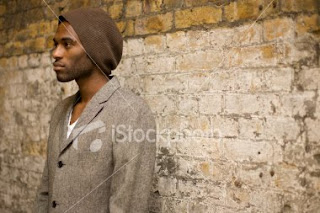
The initial idea was to have Charlie and the wall behind him in black and white and the rest of the photo in colour to single him out from the rest, but that didn't work out because he looked like a ghost and to be fair it looked very dull and not appealing which isn't the approach we wanted.
At first we tried using screen grabs from the video to use as the pictures in the ancillary tasks, but the because of the quality of the video we thought it was best to take separate pictures just for the use of the DVD cover and magazine add which worked in our favour, because we could get charlie in the location and position of our choice . I think through the ancillary tasks the DVD cover and the magazine add, we have been able to keep the indie theme going which is a lighthearted down to earth theme which i think will appeal to our target market because thats who they want to listen to, not some outlandish guy in ridiculous costume in the middle of a swimming pool.
By taking in to account the Mise en scene we looked at location, props and costume in the video, we got charlie to stand in front of a brick wall with leaves at his feet crouching for one shot then standing for the other because even though we wanted to keep the theme and genre going we also wanted to show a bit of variety otherwise there wouldn't be much difference and it would have looked like we couldn't be bothered to create a new idea.
3. What have you learnt from your audience feedback?
Our original idea was to have the band performing in a field then cutscenes with charlie walking down streets, but when we hired the camera for the weekend and traveled to Bassenbourne the weather wasn't ideal because it had rained so the field was muddy so the equipment would get destroyed.
From speaking with Andrea as a group, we have decided to focus on the walking down different streets and move away from the scenes in the house and bathroom because they didnt need to be there and had nothing to do with the genre. Andrea thought that charlie walking down the street at the start was a bit not boring but it dragged on abit and thats where the idea for the screen splitting up came in so there was a bit of variety. We were given useful criticism about some of slides in the house, because we used natural light which was rather dull and as a viewer you couldnt see what was going on, so we used a light filter.
Looking at our groups peer feedback we found a lot of positive feedback from one of our classmates group. Group 20 liked some of the effects we used e.g. the multiple frames of the same shot and the writing around the main protagonist. Even though it wasn't said, personally i got the impression that people thought we repeated some of the shots too many times. The cut scene where Charlie was walking down the street got a bit repetative and if effects weren't used i think that if this was being watched on MTV the viewer would have found it not very interesting.
How did you use new media technology in the construction and research, planning and evaluation stages?
The first step to any successful production is planning thats why in our first few lessons we started using www.blogger.com. Blogger is a website where you make a blog and you or in our case anyone in our group can access it any time and add to it. Our first task was to choose which song we were going to perform in our video, we had 3 in mind and an idea for all of them. During the course we added to the blog sharing our ideas and opinions. We could upload videos such as other music videos to compare and annotate and also we uploaded our rough cut and final cut of our music videos.
We continued using final cut to edit our video and because we have used it before we were able to develop our skills using more effects and transitions . Filters were also used and needed in our production because of our choice to use natural lighting.
Photoshop was the other program we used to create our ancillary tasks. Photoshop was helpful in that it allowed us to take images and edit them how we wished and what looks best. Using 'posterization' we were able to create a link in between the DVD cover and the magazine add displaying a sort of grainy edgy look.
Media Studies Evaluation - Charmaine Christie
In what ways does your media product use, develop or challenge forms and conventions of real media products?
The music video we made was a complimentary representation of an indie soundtrack for the artist ‘Butch Walker’. A convention of indie genre music videos that we drew on was to focus on capturing natural footage, which appears to follow the artist on a normal day. We focused on a single main artist lip-synching to the soundtrack, who also has a band which performs with him. We tried to follow typical conventions of an indie genre by opening the video with an establishing shot of the drums which turns into footage of a band performing. We also filmed close-up shots of typical rock instruments such as guitar and drums, to have a strong visual link to the indie rock genre.
We chose to dress the artist in casual, indie clothing to appeal to the target audience of teenagers and young adults who like indie culture. However, we chose to challenge the general gender form of bands, seen in most music videos, by using a mixture of male and female band members, as rock bands and rock music are stereotypically male dominated. This helps make the band more appealing to both genders of the target audience, as female fans would be attracted to the boys in the band, whilst aspiring to be like the girls, and vice versa for male fans.
The video is performance based, including many shots of the artist in a variety of costumes, filmed form different angles. The footage of the artist performing with a band makes him instantly desirable to an indie audience, which stereotypically enjoys band music. As well as this we made sure to single the artist out for most of the video to make him ‘special’ and to make sure the viewer recognises him as the main artist. The use of different angles is used to show the artist in a variety of ways, using close-ups of the artist singing focuses on the artist’s emotion and is good for marketing purposes as people will recognise him. As well as this we used side shots and front shots of him walking down the streets. The variety of shots sells the artist to the audience and conforms to the demands of the record label, which wants the artist to be shown in different ways that will attract the audience to him.
The video is very voyeuristic as the audience are invited to watch what looks like a private band performance, which was filmed within the music room. The video is also mainly made up of footage of the artist walking down different streets towards the camera, which we filmed using a dolly. This is also a good example of voyeurism that we used as it gives an impression of paparazzi following the artist, or that the viewer themselves is walking down the street with him. As well as this, the artist uses a lot of direct gaze in order to engage the viewer and make them feel connected. This again conforms with the demands of the record label as the viewer feels special, so is more likely to remember the artist and buy the record.
To make the video stand out, I added some effects to the footage using a feature within final cut, which multiplied the image within the same screen, which I then cut this to the beat. This created a strong link between music and visuals. There are links between lyrics and visuals, such as when the line such as when the line ‘so put in your ski cap and maybe a vest’ is sung, the artist is seen wearing a ski cap and pulls at his jumper. As the line ‘you hair is a fucking mess’ is sung, the artist runs his hand over his hair to mess it up and when the line ‘I can’t find my shoes’ is sung there is a close-up of the artist’s feet walking along the street barefoot.
However, our main idea to create a strong relationship between visuals and lyrics was to overlay text that spells out the lyrics as they are sung around the footage. Something that I also suggested to make the video appear more professional was to add the title of the track and the artist to the corner of the video in the beginning of the video, as it appears on video’s seen on music channels.
How effective is the combination of your main product and ancillary texts?
We had to produce two ancillary products to coincide with our main media product, these were a DVD cover and a magazine advert. Although we create the products as a group, I managed the production of the DVD cover, whilst another member of the group managed the making of the magazine advert.
Using screen grabs for the images would be too blurry, so we decided to choose to use images that were all taken within a single photo shoot. Although we used different images, we made sure they were similar enough to have a strong visual link. All of the images featured on the ancillary tasks were of the artist for the purpose of the demands of the record label. He is featured as an ordinary person, posed in a relaxed, cool way against the wall, which would make the target audience feel attracted to him as an artist. Both the tasks had the same text font and colour for the song and artist titles and other text to link them together.
In an initial idea I created for the magazine cover, I used a colour image and edited it to black and white in Photoshop. I decided to keep the leaves and shirt in colour to make the image different and quirky and edited them so that the colour was brighter with more contrast to make them more eye-catching to the magazine reader. The blue accent of the shirt works well with the blue writing, that I put in bold and added an effect of shadowing to make it stand out. I then added a banner in the corner of the advert, advertising when the DVD becomes available for purchase.
However, we decided that this was not bright enough because of the black and white background, which also made the artist appear a bit ghostly. Therefore went with a bright option that fitted with the DVD cover.
As well as this, the DVD cover included a barcode, the record label ‘Regular Records’, the DVD symbol, a track listing, a list of special features, a recommendation from ‘NME’, general DVD icons such as ‘Fact’ and ‘Ministry of Sound’, stills from the music video and an age certificate of 15, plus a parental guidance icon due to the swearing on the track. Special features and extra features, such as an interview with the artist, add value to the DVD which means it could be sold at a higher price than normal. I decided to add a live version of the track onto the track listing, because research into current indie DVDs proves that live versions of songs and live footage are popular amongst the indie audience, so it is something that would make the DVD desirable for our target audience.
The magazine advert included the date of the DVD release, the artist website, where the DVD could be found, the record label and like on the DVD, general icons linked to the track such as ‘Ministry of Sound’.
The products were created in Photoshop and we edited the images using a ‘posterization’ feature within the programme. We decided to use this feature to edit all images so that it acts as a motif between the products and links them to one another easily as a promotional package. The use of this edit also fit with the indie genre as it makes the images stand out and appear quirky and different.
What have you learnt from your audience feedback?
Our original pitch for the track was for the video to be a mixture of performance and narrative, following the artist through his day after a party, adding in footage of him walking down streets singing into the camera and performing within a band. However, during our overnight use of filming equipment, we experienced problems with the weather that made it difficult for us to film overall and prevented us from following our original idea, for example we could not have the band performing in a field.
We uploaded a rough-cut video which included the footage we had obtained from that filming session. Our feedback from that video said that ‘performance is typical of this genre and this music video includes a lot of varying performance which is good. It is good that it shows the whole band as well as the lead vocalist’ but suggested that we should replace our narrative footage and turn our video into a performance based concept, ‘I think the band performance is the strongest footage you have, along with the walking shots’. We needed to introduce footage of the artist walking down streets earlier on within the video to set up the main idea of the video, and then cut between this footage and footage of the band performing.
We also needed a series of main scenes that we could cut back to throughout the video. In order to do this, we had to spend another session on filming more footage of the artist walking down different streets. The feedback liked the close-ups of the instruments ‘I really like the close-ups of the instruments’ and suggested that we also add in more close-ups of the artist ‘I would also advise you to have more close-ups’ in order to ‘sell the artist’. Therefore we also made sure we filmed more close-ups on our last shoot.
After re-shooting some more footage we re-edited the video using the new footage and turned it into a performance based concept video. After posting it on our blog, we received some further feedback on our final video. It stated that our video used genre characteristics that are ‘typical of a rock/pop song as there is performance from the band as well as the main artist’. It was implied that our use of lyrics and visuals were effective as they stated that ‘the visuals within the music video illustrate the lyrics; an example of this is the line “I can’t find my shoes” the visuals show the artist walking along the pavement without shoes on. Another example of this is that the lyrics state “hair is a mess” and the main artist is playing with his hair but also there is text saying the lyrics within the frame’.
The feedback also commented on how ‘the visuals and music within the video complement each other’, for example with the way that ‘the artist is walking down the street and on the beat each time the image is doubled it starts out with the image, it is then doubled and ends up with many copies of the same image’. They also say that the ‘demand of the record label would have been met as the video completely focuses on the main artist and the band’, which is also what we intended as a performance video.
More general comments were also made on how the video was filmed well, stating that ‘the camera work used within the video is very effective’ and that ‘even though the camera is moving it is still steady as the artist is walking’.
How did you use new media technologies in the construction and research, planning and evaluation stages?
Before beginning our project we researched into different music directors, by watching DVDs featuring some of the music videos they have directed and watching interviews with them. We also watched different music videos and analysed them using Goodwin’s theory, which is what we would be using in order to create our own video. We created PowerPoint presentations on the information we had found out about the directors and music video analysis and posted them on our blog once we had become a group, to share our information.
The internet was an important part of our research as we used the internet in order to research the indie genre in order to help us create our video. We collected images from www.google.co.uk and created a mood board from them, in order to give a general representation of the mise-en-scene of the type of video we wanted to make. We used the video hosting site www.youtube.com to research into indie music videos and get an idea of what they feature, such as a band performance and what types of instruments.
To research into our target audience we got feedback from our class which was posted on www.blogger.com. As well as this we used Blogger to host all of our work on, so we could keep track of how we were progressing throughout the project. It was also somewhere where we could easily share information with one another and could all quickly obtain information from. Having all of our work from the project posted in one placed helped us stay organised as a group and could split off and post blogs separately in order to move on faster. By posting images and videos that tracked our progress, such as the rough-cut video, on the blog, we could get feedback on them which intern helped us to move onto the next stage with some helpful guidance.
In order to create our music video we used the programme Final Cut, which allowed us to cut and edit our footage together as we wished. As well as this it gave us the opportunity to apply effects to change the quality of the footage, by making it lighter, and to multiply the scene to give our video a bit of edge.
The other programme we used was Photoshop, which we used to create our ancillary tasks in. Photoshop allowed us to edit the images we had chosen for the magazine advert and the DVD cover, for example to make the colour within the DVD cover image brighter, to make the leaves stand out more and make the image more effective. The ‘posterization’ effect was also very useful as it helped us to link the tasks together in a way that also made them edgy and eye-catching, as parts of the image were made to appear cartoon like, whilst the rest of the image remains normal.
Overall, I do not think that we would have been able to produce our music video or ancillary tasks as easily as we did without the use of new technologies such as what I have mentioned.


Magazine cover initial idea

As a group we took photos of the artist against a wall with leaves below. I liked the colours within the image and decided to edit them and add bright text to stand out, but that also went along with the general colour scheme. I edited the background to black and white and keep the leaves and shirt in colour to make the image different and quirky. The blue accent of the shirt then went with the writing.
Thursday, 26 November 2009
Magazine Advert
Monday, 23 November 2009
Peer Feedback for music video

 are typical of a rock/pop song as there is performance from the band as well as the main artist. This is typical as there is a shot of the main artist then it is cut and the audience sees the band again.
 that the lyrics state “hair is a mess” and the main artist is playing with his hair but also there is text saying the lyrics within the frame.
 ain and there is a switch between the drums and guitar, this is done as the audience can hear them and see them at the same time. Also in the video editing has been used to go along with the beat of the song. This is when the artist is walking down the street and on the beat each time the image is doubled it starts out with the image, it is then doubled and ends up with many copies of the same image. This is done four times within the video as this is how many times the instrumental is repeated.
Tuesday, 17 November 2009
Image For Idea One (MAYBE)
 This is an example shot taken from the footage that we were considering using for our final idea.
Magazine Advert

The idea for the magazine advert is to take a picture of Porson Avenue which is a alleyway we shot down. With this image we want to put pictures of clothes in and make it look like they are laying on the floor. this would link into the title as it is "Too Famous To Get Fully Dressed". it would also link because it is down the street we filmed on. with this the title name would be dotted around the screen to make it a bit different.
CD Cover Idea
 This is a image from the opening titles of a film called Juno. The idea i have is similar to this but slightly different. My idea is to take a shot of me walking down one of the streets and take away the natural background and then create a cartoon background so the bushes would be bright green and all one colour. I believe that this would be good because it would make the product stand out because of the bright colours it would make the CD cover eye catching. The final piece would look like this one but instead of having normal clothes my face would be natural colours. The shot of me i would like to use would be when i am walking down a residential road where there are bushes on my left and grass and trees on my right. Or alternatively the one next to the main road and just have one car in it which would be changed into cartoon. This would be a lot more difficult though. The main reason for me doing this is because i want the product to be eye catching and very different to any other CD cover. This is the type of shot i would like to use for the CD cover.
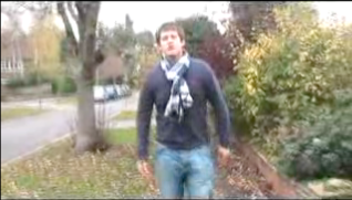
Idea One

This is a few drawings of ideas we have been brain storming for our media project. We have the basic idea drawn up here and the other ideas are being drawn up.
Camera Loan
There are two ideas that we are going to try out one of which Charlie came up with which is of clothes scattered around the locations in the video and cartooned up a bit and made to look a bit smart.
The second idea we have is of the basic shot that is in the original footage of him leaning against the lamp post and of him smirking at the camera maybe more tilted to bring some artistic qualities out.
We plan on loaning a camera out on the Friday lesson to create and take the pictures so we have time to work on the final pictures.
Digipak cover

I think that this image would work well for the digipak cover, as it is a close-up image of the artist using direct gaze, which is good for the demands of the record label as people will straight away be able to recognise the artist and link the image to the music video.

However, I think that a image featuring a whole band will relate to the target audience, of teenagers who like indie music/scene, more as they tyically enjoy band music and will immediatly see the artist performaing in a band. It also cummunicates the genre well as indie music tends to be made up of bands and includes instruments, so this image applies with the genre characteristics.
I think this shot would be the best choice for a Digipak cover because it shows the whole band and shows the lead singer. I think having the band is better than just the lead singer because its better to show people its a band otherwise it can misguiding and look like a solo album.
Monday, 16 November 2009
Digi Pak and CD cover.
I think this shot would be a good one to use as it has features many features that adapt onto our main intent, such as the image of the artist shows who it is based around and to give the band publicity. By using this shot you can also see the genre of the music as the artist is wearing general quite casual clothes that could be interpreted as indie which is what we had been aiming for. By stylising Charlie we have tried to reach out to our audience as a high selling point so i think this shot would work.
Another idea would be to use a shot of the whole band as this brings out more of a band look and has the retro rock look even though in most of the shots the band are looking in the more indie rocker looks but it gives the same representation of the group and their style.
Both of these ideas are good but out of them i prefer the first main idea as i think the shot looks more official unlike the band shot which has less credabilty.
Possible Dvd Cover
The immaculate collection By Madonna - DVD Cover.


The DVD case uses the distinct image of of a stylised image of Madonna which looks like its been shot or screen grabbed from the actual music video. The main background is featured on a blue background, which fits in with the Madonna label on the bottom right corner which represents the song. Madonnas picture is formatted in a modern style with extreme eyelashes that pull out the facial look and bring out the musician.
Digipak
A digipak consists of various special edition content e.g.
- extra features
- interviews
- making of
- posters
- vouchers
- bonus tracks
- track list
Conventions of Magazine Adverts
- Artist name
- website, facebook, myspace, music press
- reviews
- where available
Analysis of Magazine Advert

The poster is advertising a Live CD and DVD, this is obvious to see as it is in bold, capitals in white which contrasts with the negative background. The name of the product being advertising is 'Milwaukee At Last!!!' which is eye-catching, as the text is bright and multi-coloured, which contrasts to the black background. The artists name 'Rufus Wainwright' is featured in between the dvd title, which makes the poster quirky to fit with the artists image. The relevant information of when the product is released 'out 7th september' is featured at the center, bottom of the advert and includes information about what the dvd shall contain 'contains 4 exclusive postcards'. In the bottom left hand corner is the artists official website 'www.rufuswainwright.com', which is in much smaller text than the rest of the information as it is more insignificant. On the bottom right hand side of the advert is the artists record label 'DECCA records - a universal record company' and where you can buy the product from 'amazon co uk'.
Wednesday, 11 November 2009
Editing
Tuesday, 10 November 2009
Feedback
Editing
Editing 09/11.09
We shall continue editing next lesson and have booked time to edit after college also.
Filming
Wednesday, 4 November 2009
Plan for Re-Shoot
We are going to re-shoot footage on friday 6th, which will then leave us monday, tuesday and friday to edit, plus because of open evening on wednesday we have booked our computer so we can come in and edit then too.
What we are shooting:
The artist, Charles, walking along various streets in different costumes, for the whole of the song track, including him singing. We will get a variety of shots, (long shots, medium shots, side shots) and will also capture some clear close-ups of charles singing, as from our feedback it is suggested that we need clearer footage of the artist singing in our video, so this should rectify this problem. The footage will be cut together and we shall also try to slipt screen it so he is walkjing side by side in different areas in the video, singing down different streets, these scenes can be added in throughout the video, along with more band performance, which were said to be our best pieces of footage and will help our video have more continuity, as our feedback said that this is needed to make the video less confused.
People Acting:
- Charles
People Filming:
- Charmaine
- Lilly
- Stephen
Then we shall edit as a group next week.
Tuesday, 3 November 2009
Group Review
In the new footage we will also try to capture more variety in shots, (such as long shots, close-ups and side shots). Charlie will re-learn the lyrics to make sure that we can get some clear shots of the artist singing for artist representation and to meet the demands of the record label.
Teacher Rough Cut Feedback
I would also advise you to have more close-ups. Remember that the point of a music video is to sell the artist as well as the song and you can't do that if you can't see your artist clearly.
I really like the close-ups of the instruments too.
The selection of mise-en-scene could be stronger, what makes your video look less like a group of students messing around and more like a professional music video?
Look at this video as a strong example of how to make a video that doesn't look like student's dancing around but looks, 90% of the time, like a professional artist starring in their music video
I realise that the above video is a different genre to yours but the things that make it good could equally be applied to your song. Use it as a basis to discuss what is needed to make your video better.
You have worked well so far - keep going.
Peer Feedback
The amount of different shots meant that we kept interested. There was, however, a large gap in the middle of the film which detracted from the overall story.
Peer Feedback
Music and Visuals - the guitar solo seemed to be more focused on the bass than the guitar, the cuts are up beat and movements made during the performance and narrative are to the beat.
Peer Feedback
Lyrics & Visuals:
There are a lot of scenes when the lyrics relate to the visuals for instance when the singer quotes ' I cant find my shoes', and the video shows the character without his shoes. Furthermore the singer also quotes 'put on your ski hat and your vest' and shows the character putting on his vest. However the video could be improved by showing more of the band.
Rough Cut Genre Characteristics Feedback
More shot types could be used and in some points of the film people are cut out of the shot or covered by other actors. The lip syncing is good and the rest of the video is very entertaining and technically good.
Tuesday, 20 October 2009
Front Cover Idea's.

Digi Pak
Incident
Editing
Charlie looked over the work and added to the video, suggesting what we should change, for example, cutting more of the clips quicker to add in more of a variety of clips at a faster pace so the video is more interesting and the viewer does not loose interest.
We plan to finish off the rough cut next lesson.
Monday, 19 October 2009
Cutting your video
Friday, 16 October 2009
Band Shot
Tuesday, 13 October 2009
Field Scene
- guitar straps
- another guitar
- more drum kit
Teacher Feedback on blog and pitch
Also you need to try and make contact with the artist. Write to them from their myspace page and take a screen grab of your attempt to contact them.
Your pitch was very convincing but it feels from your blog as if your ideas have got a little lost, there are some posts which are currently incomplete - this needs to be sorted out. Where are the storyboard images you have taken, if you have made an animatic you must upload it. Also you need to communicate the overall style you are trying to achieve - post more videos that influence you, both student and professional videos. Take a look at blog of the week for more inspiration on how to enhance your blog.
Great work so far, keep going.
Monday, 12 October 2009
Mishaps.
Sunday, 11 October 2009
!


call sheet
music studio loc3
Charlie Littlefair
Lily Warne
Charmane Christie


