

Magazine cover initial idea

As a group we took photos of the artist against a wall with leaves below. I liked the colours within the image and decided to edit them and add bright text to stand out, but that also went along with the general colour scheme. I edited the background to black and white and keep the leaves and shirt in colour to make the image different and quirky. The blue accent of the shirt then went with the writing.
Thursday, 26 November 2009
Magazine Advert
I have developed my first idea of having a cartoon background and the lead singer in natural. i decided rather than taking an image from the future i would use one of the pictures taken on the photoshoot. this is becasue if i took an image from the future it wouldnt be as good quality. i have used a simple shot of me up against a brick wall. i have then changed the bricks into cartoon on photoshot and then i have changed some of the bricks into 6 different bright colours. this keeps it with my initial idea of making the magazine advert eye catching. Too make the advert as much like a real advert i have added some logos onto the bottom and i hope to also add copyright and trade mark logos in as well. I have put the title of the song onto my legs as i am wearing dark jeans and it makes the white font stand out and gives you something else to look at.
Monday, 23 November 2009
Peer Feedback for music video

The genre characteristics 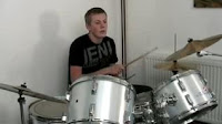 are typical of a rock/pop song as there is performance from the band as well as the main artist. This is typical as there is a shot of the main artist then it is cut and the audience sees the band again.
 are typical of a rock/pop song as there is performance from the band as well as the main artist. This is typical as there is a shot of the main artist then it is cut and the audience sees the band again.
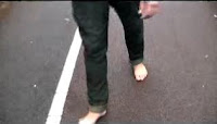
The visuals within the music video illustrate the lyrics; an example of this is the line “I can’t find my shoes” the visuals show the artist walking along the pavement without shoes on. Another example of this is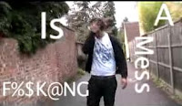 that the lyrics state “hair is a mess” and the main artist is playing with his hair but also there is text saying the lyrics within the frame.
 that the lyrics state “hair is a mess” and the main artist is playing with his hair but also there is text saying the lyrics within the frame.
The visuals and music within the video complement each other. At the start of the video we can both see and hear the band playing, this then changes and the audience is shown the main artist. Later on in the song we see the band playing ag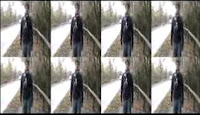 ain and there is a switch between the drums and guitar, this is done as the audience can hear them and see them at the same time. Also in the video editing has been used to go along with the beat of the song. This is when the artist is walking down the street and on the beat each time the image is doubled it starts out with the image, it is then doubled and ends up with many copies of the same image. This is done four times within the video as this is how many times the instrumental is repeated.
 ain and there is a switch between the drums and guitar, this is done as the audience can hear them and see them at the same time. Also in the video editing has been used to go along with the beat of the song. This is when the artist is walking down the street and on the beat each time the image is doubled it starts out with the image, it is then doubled and ends up with many copies of the same image. This is done four times within the video as this is how many times the instrumental is repeated.
The demand of the record label would have been met as the video completely focuses on the main artist and the band. This is because the locations used are quite simple and plain, therefore the audience is not looking at what is going on around but is focused on the artist. Also there are many mid shots of the artist where there is central framing, showing the artist in the centre of the frame. There are also a few costume changes which also promotes the artist.

The camera work used within the video is very effective. There are many mid shots of the artist in the centre of the frame; these are filmed well as even though the camera is moving it is still steady as the artist is walking. There are also close ups of the instruments which works well otherwise the same shots all the time would seem repetitive, as there are many mid shots.
The editing within the video is effective; the idea of the lyrics being written on the shot is good and gives the video a more unique visual style. Also there are quick cuts between shots which keep the attention of the viewer.
The props used in the piece are good as there are the instruments and the mic for the singer. This makes the video seem more realistic and professional which is important for the video. These are the only props used within the music video. The costumes used in the music video are what an everyday man would wear this being jeans and a top, making the artist seem like an everyday person. The lightening used within the video is natural as most of it is filmed outside; this makes the video seem light and bright and therefore fits the genre being pop/rock.
Tuesday, 17 November 2009
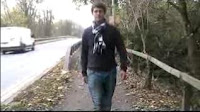
Image For Idea One (MAYBE)
 This is an example shot taken from the footage that we were considering using for our final idea.
Magazine Advert

The idea for the magazine advert is to take a picture of Porson Avenue which is a alleyway we shot down. With this image we want to put pictures of clothes in and make it look like they are laying on the floor. this would link into the title as it is "Too Famous To Get Fully Dressed". it would also link because it is down the street we filmed on. with this the title name would be dotted around the screen to make it a bit different.
CD Cover Idea
 This is a image from the opening titles of a film called Juno. The idea i have is similar to this but slightly different. My idea is to take a shot of me walking down one of the streets and take away the natural background and then create a cartoon background so the bushes would be bright green and all one colour. I believe that this would be good because it would make the product stand out because of the bright colours it would make the CD cover eye catching. The final piece would look like this one but instead of having normal clothes my face would be natural colours. The shot of me i would like to use would be when i am walking down a residential road where there are bushes on my left and grass and trees on my right. Or alternatively the one next to the main road and just have one car in it which would be changed into cartoon. This would be a lot more difficult though. The main reason for me doing this is because i want the product to be eye catching and very different to any other CD cover. This is the type of shot i would like to use for the CD cover.
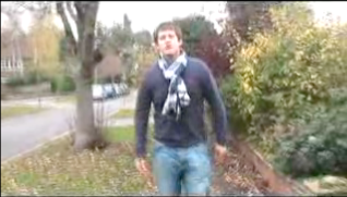
Idea One

This is a few drawings of ideas we have been brain storming for our media project. We have the basic idea drawn up here and the other ideas are being drawn up.
Camera Loan
We have decided that we are going to loan out a camera, to get some better shots for our Digi Pak so we can have more of a variety.
There are two ideas that we are going to try out one of which Charlie came up with which is of clothes scattered around the locations in the video and cartooned up a bit and made to look a bit smart.
The second idea we have is of the basic shot that is in the original footage of him leaning against the lamp post and of him smirking at the camera maybe more tilted to bring some artistic qualities out.
We plan on loaning a camera out on the Friday lesson to create and take the pictures so we have time to work on the final pictures.
Digipak cover

I think that this image would work well for the digipak cover, as it is a close-up image of the artist using direct gaze, which is good for the demands of the record label as people will straight away be able to recognise the artist and link the image to the music video.

However, I think that a image featuring a whole band will relate to the target audience, of teenagers who like indie music/scene, more as they tyically enjoy band music and will immediatly see the artist performaing in a band. It also cummunicates the genre well as indie music tends to be made up of bands and includes instruments, so this image applies with the genre characteristics.
I think this shot would be the best choice for a Digipak cover because it shows the whole band and shows the lead singer. I think having the band is better than just the lead singer because its better to show people its a band otherwise it can misguiding and look like a solo album.
Monday, 16 November 2009
Digi Pak and CD cover.
Looking into the video and idea's for our digipak and CD cover ive thought about using some of the shots,one of which is Charlie, the main lead in our music video, leant against the lamp post with a casual smirk or a serious expression.
I think this shot would be a good one to use as it has features many features that adapt onto our main intent, such as the image of the artist shows who it is based around and to give the band publicity. By using this shot you can also see the genre of the music as the artist is wearing general quite casual clothes that could be interpreted as indie which is what we had been aiming for. By stylising Charlie we have tried to reach out to our audience as a high selling point so i think this shot would work.
Another idea would be to use a shot of the whole band as this brings out more of a band look and has the retro rock look even though in most of the shots the band are looking in the more indie rocker looks but it gives the same representation of the group and their style.
Both of these ideas are good but out of them i prefer the first main idea as i think the shot looks more official unlike the band shot which has less credabilty.
Possible Dvd Cover
I dont think we have any other shots that are strong enough for the cover or the digipak. I think that there should be lots of shots like a collage of different band shots surrounding a picture of the main singer. the reason i took this picture is becsaue i think it looks like a good band shot, if i were to choose another one it would be one of the whole band performing. But i do think that we should put our stronger shot onto the back of the dvd cover.
The immaculate collection By Madonna - DVD Cover.


The DVD case uses the distinct image of of a stylised image of Madonna which looks like its been shot or screen grabbed from the actual music video. The main background is featured on a blue background, which fits in with the Madonna label on the bottom right corner which represents the song. Madonnas picture is formatted in a modern style with extreme eyelashes that pull out the facial look and bring out the musician.
The back of the DVD case has kept in the same idea as the front cover as it keeps an image of Madonna and has the same blank background which makes her stand out on the case. They have the basic song title lists in the same style as what is on the front in a gold text.
On the base of the back there is all the information such as the labels and parental guidance and the ratings to make the back official.
The DVD case has the basic spine cover with a simple text with the artists name and the album name to promote the information and advertise them. Including a rating label and the official DVD label.
Digipak
A Digipak is digital footage of the band either CD or a DVD sometimes it contains both.
A digipak consists of various special edition content e.g.
A digipak consists of various special edition content e.g.
- extra features
- interviews
- making of
- posters
- vouchers
- bonus tracks
- track list
Conventions of Magazine Adverts
the point of a magazine advert is to:
Grab peoples attention,
To advertise:
- Artist name
- website, facebook, myspace, music press
- reviews
- where available
label
Represents artists
What type of audience is it targeted at?
Relationship with other products
Analysis of Magazine Advert

The poster is advertising a Live CD and DVD, this is obvious to see as it is in bold, capitals in white which contrasts with the negative background. The name of the product being advertising is 'Milwaukee At Last!!!' which is eye-catching, as the text is bright and multi-coloured, which contrasts to the black background. The artists name 'Rufus Wainwright' is featured in between the dvd title, which makes the poster quirky to fit with the artists image. The relevant information of when the product is released 'out 7th september' is featured at the center, bottom of the advert and includes information about what the dvd shall contain 'contains 4 exclusive postcards'. In the bottom left hand corner is the artists official website 'www.rufuswainwright.com', which is in much smaller text than the rest of the information as it is more insignificant. On the bottom right hand side of the advert is the artists record label 'DECCA records - a universal record company' and where you can buy the product from 'amazon co uk'.
To the right of the advert is an image of the artists, as if he is performing live, which shows that the product is a live CD and DVD. this is needed for demands of the record label, so the audience know who the artist is.
i think that the advert is aimed at a target audience of indie teenagers as the advert is quirky, which fits the the artists image, as he is wearing colourful clothing, which the text mimics.
Wednesday, 11 November 2009
Editing
We have added effects to some of our footage to replicate the same image into multiple images on one screen to the beat of the song. We also lightened the earlier footage of the artist in the bathroom at the tap and in the bath to make the footage lighter and decided to remove the footage of the artist clearing-up a room as the footage was too grainy and not to the same standard as our latest footage. We are going to add footage of the artist walking down the street earlier on in our video to set up the scene of the video and make it flow better as a performance video, rather than some narrative early on and then complete performance for the rest.
Tuesday, 10 November 2009
Feedback
From speaking as a group and with Andrea, we have decided to focus more on the walking down different streets and drift away from the scenes in the house and bathroom. At the start we are going to have a spilt screen of all the streets i have walked down. Also there is a solo in the song and after the solo the music goes back to normal, we are going to add some effects as we don't have many at the moment. we hope to take four different and spilt them into 4,8 and then 16. We were given sum useful criticism about some of our slides in the house, because we used natural light which was rather dim we were told it would benefit us by using a lighter filter to make the shots brighter so it wouldn't look dull.
Editing
We are near the end of editing our final video, Using the skills we have learnt over the years we have managed to create a decent video with various shot, effects and unique ideas. We have not finished yet and we have all agreed to come in for open evening which means we will have a few extra hours we can use for editing and finishing up our project in time for the deadline.
Editing 09/11.09
We looked through our new footage and continued to edit the video using the new footage. We have replaced previous footage with new footage of the artist walking down the streets, which goes with our initial idea a lot more and fixes problems seen in the feedback. We also filled in the black space in our rough cut.
We shall continue editing next lesson and have booked time to edit after college also.
We shall continue editing next lesson and have booked time to edit after college also.
Filming
We filmed some more footage in our lesson on friday, which included the artist (Charles) walking down different streets, as planned, in different costume with different shot types. We also filmed some close-up shots of Charles so the video will have some clear footage of him lip-syncing.
Wednesday, 4 November 2009
Plan for Re-Shoot
Video Edit Deadline: Friday 13th November
We are going to re-shoot footage on friday 6th, which will then leave us monday, tuesday and friday to edit, plus because of open evening on wednesday we have booked our computer so we can come in and edit then too.
What we are shooting:
The artist, Charles, walking along various streets in different costumes, for the whole of the song track, including him singing. We will get a variety of shots, (long shots, medium shots, side shots) and will also capture some clear close-ups of charles singing, as from our feedback it is suggested that we need clearer footage of the artist singing in our video, so this should rectify this problem. The footage will be cut together and we shall also try to slipt screen it so he is walkjing side by side in different areas in the video, singing down different streets, these scenes can be added in throughout the video, along with more band performance, which were said to be our best pieces of footage and will help our video have more continuity, as our feedback said that this is needed to make the video less confused.
People Acting:
- Charles
People Filming:
- Charmaine
- Lilly
- Stephen
Then we shall edit as a group next week.
Tuesday, 3 November 2009
Group Review
To make the continuity of the video footage better we are going to re-shoot the artist (charlie) walking along different streets, with different costume, then we shall cut between them and also try to split screen them. This will also make the video fit better with our storyboard and will follow our original idea more, as the video has become fragmented with different scenes. However we added a mixture of different scenes to try and make the video more interesting, by giving the video a variety of scenes. Although, we understand how it could be making the video appear confused and messy so hopefully the new footage will fix that.
In the new footage we will also try to capture more variety in shots, (such as long shots, close-ups and side shots). Charlie will re-learn the lyrics to make sure that we can get some clear shots of the artist singing for artist representation and to meet the demands of the record label.
In the new footage we will also try to capture more variety in shots, (such as long shots, close-ups and side shots). Charlie will re-learn the lyrics to make sure that we can get some clear shots of the artist singing for artist representation and to meet the demands of the record label.
Teacher Rough Cut Feedback
I think the band performance is the strongest footage you have, along with the walking shots, i think you should introduce them earlier on. Have you been following your storyboard? Currently your video feels a little disjointed, and there are some continuity issues, such as your performer washing his face, then being in the bath, then being in the mirror and then back in the bath again..?
I would also advise you to have more close-ups. Remember that the point of a music video is to sell the artist as well as the song and you can't do that if you can't see your artist clearly.
I really like the close-ups of the instruments too.
The selection of mise-en-scene could be stronger, what makes your video look less like a group of students messing around and more like a professional music video?
Look at this video as a strong example of how to make a video that doesn't look like student's dancing around but looks, 90% of the time, like a professional artist starring in their music video
I realise that the above video is a different genre to yours but the things that make it good could equally be applied to your song. Use it as a basis to discuss what is needed to make your video better.
You have worked well so far - keep going.
Peer Feedback
The main character was shown in a positive way with lots of footage of him in various sequences yet they kept continuity throughout. There was plenty of close ups and he is clearly the main star.
The amount of different shots meant that we kept interested. There was, however, a large gap in the middle of the film which detracted from the overall story.
The amount of different shots meant that we kept interested. There was, however, a large gap in the middle of the film which detracted from the overall story.
Peer Feedback
s1-23 - the guitars don't seem to be plugged in during the performance aspect of the footage. The beginning cuts very well to the music and the final shot brings the cut nicely to a close. During the performance bit maybe you should be more careful about location and what's in the shot in the background. The lip syncing is well done and the performance is enthusiastic.
Music and Visuals - the guitar solo seemed to be more focused on the bass than the guitar, the cuts are up beat and movements made during the performance and narrative are to the beat.
Music and Visuals - the guitar solo seemed to be more focused on the bass than the guitar, the cuts are up beat and movements made during the performance and narrative are to the beat.
Peer Feedback
Shaun, Ruth, Emily & Gerald - Group 19
Lyrics & Visuals:
There are a lot of scenes when the lyrics relate to the visuals for instance when the singer quotes ' I cant find my shoes', and the video shows the character without his shoes. Furthermore the singer also quotes 'put on your ski hat and your vest' and shows the character putting on his vest. However the video could be improved by showing more of the band.
Rough Cut Genre Characteristics Feedback
Performance is typical of this genre and this music video includes a lot of varying performance which is good. It is good that it shows the whole band as well as the lead vocalist. The location doesn't convey a rock lifestyle so maybe for the gap extra footage could be filmed in a rocky/grungy/low lighted location. Charlie looks gorgeous in the costume but i think a bit of eyeliner could add to the costume for a rocker effect.
More shot types could be used and in some points of the film people are cut out of the shot or covered by other actors. The lip syncing is good and the rest of the video is very entertaining and technically good.
More shot types could be used and in some points of the film people are cut out of the shot or covered by other actors. The lip syncing is good and the rest of the video is very entertaining and technically good.