Showing posts with label charmaine. Show all posts
Showing posts with label charmaine. Show all posts

Friday, 11 December 2009
Media Studies Evaluation - Charmaine Christie
Music videos are seen as distinct art forms, which either follow or challenge specific genre conventions, which allow directors to produce creative products for artists. During the 1970s ‘Top of the Pops’ used music videos as a substitute for when the bands weren’t able to perform live. After this saw the beginnings of music channel ‘MTV’ and there was a boom of music video promos during the 1980s. This resulted in many spin off channels such as ‘Smash Hits’, ‘Q’ and further more specific channels such as ‘MTV Base’ and ‘MTV 2’.
In what ways does your media product use, develop or challenge forms and conventions of real media products?
The music video we made was a complimentary representation of an indie soundtrack for the artist ‘Butch Walker’. A convention of indie genre music videos that we drew on was to focus on capturing natural footage, which appears to follow the artist on a normal day. We focused on a single main artist lip-synching to the soundtrack, who also has a band which performs with him. We tried to follow typical conventions of an indie genre by opening the video with an establishing shot of the drums which turns into footage of a band performing. We also filmed close-up shots of typical rock instruments such as guitar and drums, to have a strong visual link to the indie rock genre.
We chose to dress the artist in casual, indie clothing to appeal to the target audience of teenagers and young adults who like indie culture. However, we chose to challenge the general gender form of bands, seen in most music videos, by using a mixture of male and female band members, as rock bands and rock music are stereotypically male dominated. This helps make the band more appealing to both genders of the target audience, as female fans would be attracted to the boys in the band, whilst aspiring to be like the girls, and vice versa for male fans.
The video is performance based, including many shots of the artist in a variety of costumes, filmed form different angles. The footage of the artist performing with a band makes him instantly desirable to an indie audience, which stereotypically enjoys band music. As well as this we made sure to single the artist out for most of the video to make him ‘special’ and to make sure the viewer recognises him as the main artist. The use of different angles is used to show the artist in a variety of ways, using close-ups of the artist singing focuses on the artist’s emotion and is good for marketing purposes as people will recognise him. As well as this we used side shots and front shots of him walking down the streets. The variety of shots sells the artist to the audience and conforms to the demands of the record label, which wants the artist to be shown in different ways that will attract the audience to him.
The video is very voyeuristic as the audience are invited to watch what looks like a private band performance, which was filmed within the music room. The video is also mainly made up of footage of the artist walking down different streets towards the camera, which we filmed using a dolly. This is also a good example of voyeurism that we used as it gives an impression of paparazzi following the artist, or that the viewer themselves is walking down the street with him. As well as this, the artist uses a lot of direct gaze in order to engage the viewer and make them feel connected. This again conforms with the demands of the record label as the viewer feels special, so is more likely to remember the artist and buy the record.
To make the video stand out, I added some effects to the footage using a feature within final cut, which multiplied the image within the same screen, which I then cut this to the beat. This created a strong link between music and visuals. There are links between lyrics and visuals, such as when the line such as when the line ‘so put in your ski cap and maybe a vest’ is sung, the artist is seen wearing a ski cap and pulls at his jumper. As the line ‘you hair is a fucking mess’ is sung, the artist runs his hand over his hair to mess it up and when the line ‘I can’t find my shoes’ is sung there is a close-up of the artist’s feet walking along the street barefoot.
However, our main idea to create a strong relationship between visuals and lyrics was to overlay text that spells out the lyrics as they are sung around the footage. Something that I also suggested to make the video appear more professional was to add the title of the track and the artist to the corner of the video in the beginning of the video, as it appears on video’s seen on music channels.
How effective is the combination of your main product and ancillary texts?
We had to produce two ancillary products to coincide with our main media product, these were a DVD cover and a magazine advert. Although we create the products as a group, I managed the production of the DVD cover, whilst another member of the group managed the making of the magazine advert.
Using screen grabs for the images would be too blurry, so we decided to choose to use images that were all taken within a single photo shoot. Although we used different images, we made sure they were similar enough to have a strong visual link. All of the images featured on the ancillary tasks were of the artist for the purpose of the demands of the record label. He is featured as an ordinary person, posed in a relaxed, cool way against the wall, which would make the target audience feel attracted to him as an artist. Both the tasks had the same text font and colour for the song and artist titles and other text to link them together.
In an initial idea I created for the magazine cover, I used a colour image and edited it to black and white in Photoshop. I decided to keep the leaves and shirt in colour to make the image different and quirky and edited them so that the colour was brighter with more contrast to make them more eye-catching to the magazine reader. The blue accent of the shirt works well with the blue writing, that I put in bold and added an effect of shadowing to make it stand out. I then added a banner in the corner of the advert, advertising when the DVD becomes available for purchase.
However, we decided that this was not bright enough because of the black and white background, which also made the artist appear a bit ghostly. Therefore went with a bright option that fitted with the DVD cover.
As well as this, the DVD cover included a barcode, the record label ‘Regular Records’, the DVD symbol, a track listing, a list of special features, a recommendation from ‘NME’, general DVD icons such as ‘Fact’ and ‘Ministry of Sound’, stills from the music video and an age certificate of 15, plus a parental guidance icon due to the swearing on the track. Special features and extra features, such as an interview with the artist, add value to the DVD which means it could be sold at a higher price than normal. I decided to add a live version of the track onto the track listing, because research into current indie DVDs proves that live versions of songs and live footage are popular amongst the indie audience, so it is something that would make the DVD desirable for our target audience.
The magazine advert included the date of the DVD release, the artist website, where the DVD could be found, the record label and like on the DVD, general icons linked to the track such as ‘Ministry of Sound’.
The products were created in Photoshop and we edited the images using a ‘posterization’ feature within the programme. We decided to use this feature to edit all images so that it acts as a motif between the products and links them to one another easily as a promotional package. The use of this edit also fit with the indie genre as it makes the images stand out and appear quirky and different.
What have you learnt from your audience feedback?
Our original pitch for the track was for the video to be a mixture of performance and narrative, following the artist through his day after a party, adding in footage of him walking down streets singing into the camera and performing within a band. However, during our overnight use of filming equipment, we experienced problems with the weather that made it difficult for us to film overall and prevented us from following our original idea, for example we could not have the band performing in a field.
We uploaded a rough-cut video which included the footage we had obtained from that filming session. Our feedback from that video said that ‘performance is typical of this genre and this music video includes a lot of varying performance which is good. It is good that it shows the whole band as well as the lead vocalist’ but suggested that we should replace our narrative footage and turn our video into a performance based concept, ‘I think the band performance is the strongest footage you have, along with the walking shots’. We needed to introduce footage of the artist walking down streets earlier on within the video to set up the main idea of the video, and then cut between this footage and footage of the band performing.
We also needed a series of main scenes that we could cut back to throughout the video. In order to do this, we had to spend another session on filming more footage of the artist walking down different streets. The feedback liked the close-ups of the instruments ‘I really like the close-ups of the instruments’ and suggested that we also add in more close-ups of the artist ‘I would also advise you to have more close-ups’ in order to ‘sell the artist’. Therefore we also made sure we filmed more close-ups on our last shoot.
After re-shooting some more footage we re-edited the video using the new footage and turned it into a performance based concept video. After posting it on our blog, we received some further feedback on our final video. It stated that our video used genre characteristics that are ‘typical of a rock/pop song as there is performance from the band as well as the main artist’. It was implied that our use of lyrics and visuals were effective as they stated that ‘the visuals within the music video illustrate the lyrics; an example of this is the line “I can’t find my shoes” the visuals show the artist walking along the pavement without shoes on. Another example of this is that the lyrics state “hair is a mess” and the main artist is playing with his hair but also there is text saying the lyrics within the frame’.
The feedback also commented on how ‘the visuals and music within the video complement each other’, for example with the way that ‘the artist is walking down the street and on the beat each time the image is doubled it starts out with the image, it is then doubled and ends up with many copies of the same image’. They also say that the ‘demand of the record label would have been met as the video completely focuses on the main artist and the band’, which is also what we intended as a performance video.
More general comments were also made on how the video was filmed well, stating that ‘the camera work used within the video is very effective’ and that ‘even though the camera is moving it is still steady as the artist is walking’.
How did you use new media technologies in the construction and research, planning and evaluation stages?
Before beginning our project we researched into different music directors, by watching DVDs featuring some of the music videos they have directed and watching interviews with them. We also watched different music videos and analysed them using Goodwin’s theory, which is what we would be using in order to create our own video. We created PowerPoint presentations on the information we had found out about the directors and music video analysis and posted them on our blog once we had become a group, to share our information.
The internet was an important part of our research as we used the internet in order to research the indie genre in order to help us create our video. We collected images from www.google.co.uk and created a mood board from them, in order to give a general representation of the mise-en-scene of the type of video we wanted to make. We used the video hosting site www.youtube.com to research into indie music videos and get an idea of what they feature, such as a band performance and what types of instruments.
To research into our target audience we got feedback from our class which was posted on www.blogger.com. As well as this we used Blogger to host all of our work on, so we could keep track of how we were progressing throughout the project. It was also somewhere where we could easily share information with one another and could all quickly obtain information from. Having all of our work from the project posted in one placed helped us stay organised as a group and could split off and post blogs separately in order to move on faster. By posting images and videos that tracked our progress, such as the rough-cut video, on the blog, we could get feedback on them which intern helped us to move onto the next stage with some helpful guidance.
In order to create our music video we used the programme Final Cut, which allowed us to cut and edit our footage together as we wished. As well as this it gave us the opportunity to apply effects to change the quality of the footage, by making it lighter, and to multiply the scene to give our video a bit of edge.
The other programme we used was Photoshop, which we used to create our ancillary tasks in. Photoshop allowed us to edit the images we had chosen for the magazine advert and the DVD cover, for example to make the colour within the DVD cover image brighter, to make the leaves stand out more and make the image more effective. The ‘posterization’ effect was also very useful as it helped us to link the tasks together in a way that also made them edgy and eye-catching, as parts of the image were made to appear cartoon like, whilst the rest of the image remains normal.
Overall, I do not think that we would have been able to produce our music video or ancillary tasks as easily as we did without the use of new technologies such as what I have mentioned.
In what ways does your media product use, develop or challenge forms and conventions of real media products?
The music video we made was a complimentary representation of an indie soundtrack for the artist ‘Butch Walker’. A convention of indie genre music videos that we drew on was to focus on capturing natural footage, which appears to follow the artist on a normal day. We focused on a single main artist lip-synching to the soundtrack, who also has a band which performs with him. We tried to follow typical conventions of an indie genre by opening the video with an establishing shot of the drums which turns into footage of a band performing. We also filmed close-up shots of typical rock instruments such as guitar and drums, to have a strong visual link to the indie rock genre.
We chose to dress the artist in casual, indie clothing to appeal to the target audience of teenagers and young adults who like indie culture. However, we chose to challenge the general gender form of bands, seen in most music videos, by using a mixture of male and female band members, as rock bands and rock music are stereotypically male dominated. This helps make the band more appealing to both genders of the target audience, as female fans would be attracted to the boys in the band, whilst aspiring to be like the girls, and vice versa for male fans.
The video is performance based, including many shots of the artist in a variety of costumes, filmed form different angles. The footage of the artist performing with a band makes him instantly desirable to an indie audience, which stereotypically enjoys band music. As well as this we made sure to single the artist out for most of the video to make him ‘special’ and to make sure the viewer recognises him as the main artist. The use of different angles is used to show the artist in a variety of ways, using close-ups of the artist singing focuses on the artist’s emotion and is good for marketing purposes as people will recognise him. As well as this we used side shots and front shots of him walking down the streets. The variety of shots sells the artist to the audience and conforms to the demands of the record label, which wants the artist to be shown in different ways that will attract the audience to him.
The video is very voyeuristic as the audience are invited to watch what looks like a private band performance, which was filmed within the music room. The video is also mainly made up of footage of the artist walking down different streets towards the camera, which we filmed using a dolly. This is also a good example of voyeurism that we used as it gives an impression of paparazzi following the artist, or that the viewer themselves is walking down the street with him. As well as this, the artist uses a lot of direct gaze in order to engage the viewer and make them feel connected. This again conforms with the demands of the record label as the viewer feels special, so is more likely to remember the artist and buy the record.
To make the video stand out, I added some effects to the footage using a feature within final cut, which multiplied the image within the same screen, which I then cut this to the beat. This created a strong link between music and visuals. There are links between lyrics and visuals, such as when the line such as when the line ‘so put in your ski cap and maybe a vest’ is sung, the artist is seen wearing a ski cap and pulls at his jumper. As the line ‘you hair is a fucking mess’ is sung, the artist runs his hand over his hair to mess it up and when the line ‘I can’t find my shoes’ is sung there is a close-up of the artist’s feet walking along the street barefoot.
However, our main idea to create a strong relationship between visuals and lyrics was to overlay text that spells out the lyrics as they are sung around the footage. Something that I also suggested to make the video appear more professional was to add the title of the track and the artist to the corner of the video in the beginning of the video, as it appears on video’s seen on music channels.
How effective is the combination of your main product and ancillary texts?
We had to produce two ancillary products to coincide with our main media product, these were a DVD cover and a magazine advert. Although we create the products as a group, I managed the production of the DVD cover, whilst another member of the group managed the making of the magazine advert.
Using screen grabs for the images would be too blurry, so we decided to choose to use images that were all taken within a single photo shoot. Although we used different images, we made sure they were similar enough to have a strong visual link. All of the images featured on the ancillary tasks were of the artist for the purpose of the demands of the record label. He is featured as an ordinary person, posed in a relaxed, cool way against the wall, which would make the target audience feel attracted to him as an artist. Both the tasks had the same text font and colour for the song and artist titles and other text to link them together.
In an initial idea I created for the magazine cover, I used a colour image and edited it to black and white in Photoshop. I decided to keep the leaves and shirt in colour to make the image different and quirky and edited them so that the colour was brighter with more contrast to make them more eye-catching to the magazine reader. The blue accent of the shirt works well with the blue writing, that I put in bold and added an effect of shadowing to make it stand out. I then added a banner in the corner of the advert, advertising when the DVD becomes available for purchase.
However, we decided that this was not bright enough because of the black and white background, which also made the artist appear a bit ghostly. Therefore went with a bright option that fitted with the DVD cover.
As well as this, the DVD cover included a barcode, the record label ‘Regular Records’, the DVD symbol, a track listing, a list of special features, a recommendation from ‘NME’, general DVD icons such as ‘Fact’ and ‘Ministry of Sound’, stills from the music video and an age certificate of 15, plus a parental guidance icon due to the swearing on the track. Special features and extra features, such as an interview with the artist, add value to the DVD which means it could be sold at a higher price than normal. I decided to add a live version of the track onto the track listing, because research into current indie DVDs proves that live versions of songs and live footage are popular amongst the indie audience, so it is something that would make the DVD desirable for our target audience.
The magazine advert included the date of the DVD release, the artist website, where the DVD could be found, the record label and like on the DVD, general icons linked to the track such as ‘Ministry of Sound’.
The products were created in Photoshop and we edited the images using a ‘posterization’ feature within the programme. We decided to use this feature to edit all images so that it acts as a motif between the products and links them to one another easily as a promotional package. The use of this edit also fit with the indie genre as it makes the images stand out and appear quirky and different.
What have you learnt from your audience feedback?
Our original pitch for the track was for the video to be a mixture of performance and narrative, following the artist through his day after a party, adding in footage of him walking down streets singing into the camera and performing within a band. However, during our overnight use of filming equipment, we experienced problems with the weather that made it difficult for us to film overall and prevented us from following our original idea, for example we could not have the band performing in a field.
We uploaded a rough-cut video which included the footage we had obtained from that filming session. Our feedback from that video said that ‘performance is typical of this genre and this music video includes a lot of varying performance which is good. It is good that it shows the whole band as well as the lead vocalist’ but suggested that we should replace our narrative footage and turn our video into a performance based concept, ‘I think the band performance is the strongest footage you have, along with the walking shots’. We needed to introduce footage of the artist walking down streets earlier on within the video to set up the main idea of the video, and then cut between this footage and footage of the band performing.
We also needed a series of main scenes that we could cut back to throughout the video. In order to do this, we had to spend another session on filming more footage of the artist walking down different streets. The feedback liked the close-ups of the instruments ‘I really like the close-ups of the instruments’ and suggested that we also add in more close-ups of the artist ‘I would also advise you to have more close-ups’ in order to ‘sell the artist’. Therefore we also made sure we filmed more close-ups on our last shoot.
After re-shooting some more footage we re-edited the video using the new footage and turned it into a performance based concept video. After posting it on our blog, we received some further feedback on our final video. It stated that our video used genre characteristics that are ‘typical of a rock/pop song as there is performance from the band as well as the main artist’. It was implied that our use of lyrics and visuals were effective as they stated that ‘the visuals within the music video illustrate the lyrics; an example of this is the line “I can’t find my shoes” the visuals show the artist walking along the pavement without shoes on. Another example of this is that the lyrics state “hair is a mess” and the main artist is playing with his hair but also there is text saying the lyrics within the frame’.
The feedback also commented on how ‘the visuals and music within the video complement each other’, for example with the way that ‘the artist is walking down the street and on the beat each time the image is doubled it starts out with the image, it is then doubled and ends up with many copies of the same image’. They also say that the ‘demand of the record label would have been met as the video completely focuses on the main artist and the band’, which is also what we intended as a performance video.
More general comments were also made on how the video was filmed well, stating that ‘the camera work used within the video is very effective’ and that ‘even though the camera is moving it is still steady as the artist is walking’.
How did you use new media technologies in the construction and research, planning and evaluation stages?
Before beginning our project we researched into different music directors, by watching DVDs featuring some of the music videos they have directed and watching interviews with them. We also watched different music videos and analysed them using Goodwin’s theory, which is what we would be using in order to create our own video. We created PowerPoint presentations on the information we had found out about the directors and music video analysis and posted them on our blog once we had become a group, to share our information.
The internet was an important part of our research as we used the internet in order to research the indie genre in order to help us create our video. We collected images from www.google.co.uk and created a mood board from them, in order to give a general representation of the mise-en-scene of the type of video we wanted to make. We used the video hosting site www.youtube.com to research into indie music videos and get an idea of what they feature, such as a band performance and what types of instruments.
To research into our target audience we got feedback from our class which was posted on www.blogger.com. As well as this we used Blogger to host all of our work on, so we could keep track of how we were progressing throughout the project. It was also somewhere where we could easily share information with one another and could all quickly obtain information from. Having all of our work from the project posted in one placed helped us stay organised as a group and could split off and post blogs separately in order to move on faster. By posting images and videos that tracked our progress, such as the rough-cut video, on the blog, we could get feedback on them which intern helped us to move onto the next stage with some helpful guidance.
In order to create our music video we used the programme Final Cut, which allowed us to cut and edit our footage together as we wished. As well as this it gave us the opportunity to apply effects to change the quality of the footage, by making it lighter, and to multiply the scene to give our video a bit of edge.
The other programme we used was Photoshop, which we used to create our ancillary tasks in. Photoshop allowed us to edit the images we had chosen for the magazine advert and the DVD cover, for example to make the colour within the DVD cover image brighter, to make the leaves stand out more and make the image more effective. The ‘posterization’ effect was also very useful as it helped us to link the tasks together in a way that also made them edgy and eye-catching, as parts of the image were made to appear cartoon like, whilst the rest of the image remains normal.
Overall, I do not think that we would have been able to produce our music video or ancillary tasks as easily as we did without the use of new technologies such as what I have mentioned.

Magazine cover initial idea

As a group we took photos of the artist against a wall with leaves below. I liked the colours within the image and decided to edit them and add bright text to stand out, but that also went along with the general colour scheme. I edited the background to black and white and keep the leaves and shirt in colour to make the image different and quirky. The blue accent of the shirt then went with the writing.
Tuesday, 17 November 2009
Image For Idea One (MAYBE)
 This is an example shot taken from the footage that we were considering using for our final idea.
Idea One

This is a few drawings of ideas we have been brain storming for our media project. We have the basic idea drawn up here and the other ideas are being drawn up.
Camera Loan
We have decided that we are going to loan out a camera, to get some better shots for our Digi Pak so we can have more of a variety.
There are two ideas that we are going to try out one of which Charlie came up with which is of clothes scattered around the locations in the video and cartooned up a bit and made to look a bit smart.
The second idea we have is of the basic shot that is in the original footage of him leaning against the lamp post and of him smirking at the camera maybe more tilted to bring some artistic qualities out.
We plan on loaning a camera out on the Friday lesson to create and take the pictures so we have time to work on the final pictures.
There are two ideas that we are going to try out one of which Charlie came up with which is of clothes scattered around the locations in the video and cartooned up a bit and made to look a bit smart.
The second idea we have is of the basic shot that is in the original footage of him leaning against the lamp post and of him smirking at the camera maybe more tilted to bring some artistic qualities out.
We plan on loaning a camera out on the Friday lesson to create and take the pictures so we have time to work on the final pictures.
Digipak cover

I think that this image would work well for the digipak cover, as it is a close-up image of the artist using direct gaze, which is good for the demands of the record label as people will straight away be able to recognise the artist and link the image to the music video.

However, I think that a image featuring a whole band will relate to the target audience, of teenagers who like indie music/scene, more as they tyically enjoy band music and will immediatly see the artist performaing in a band. It also cummunicates the genre well as indie music tends to be made up of bands and includes instruments, so this image applies with the genre characteristics.
Monday, 16 November 2009
Analysis of Magazine Advert

The poster is advertising a Live CD and DVD, this is obvious to see as it is in bold, capitals in white which contrasts with the negative background. The name of the product being advertising is 'Milwaukee At Last!!!' which is eye-catching, as the text is bright and multi-coloured, which contrasts to the black background. The artists name 'Rufus Wainwright' is featured in between the dvd title, which makes the poster quirky to fit with the artists image. The relevant information of when the product is released 'out 7th september' is featured at the center, bottom of the advert and includes information about what the dvd shall contain 'contains 4 exclusive postcards'. In the bottom left hand corner is the artists official website 'www.rufuswainwright.com', which is in much smaller text than the rest of the information as it is more insignificant. On the bottom right hand side of the advert is the artists record label 'DECCA records - a universal record company' and where you can buy the product from 'amazon co uk'.
To the right of the advert is an image of the artists, as if he is performing live, which shows that the product is a live CD and DVD. this is needed for demands of the record label, so the audience know who the artist is.
i think that the advert is aimed at a target audience of indie teenagers as the advert is quirky, which fits the the artists image, as he is wearing colourful clothing, which the text mimics.
Wednesday, 11 November 2009
Editing
We have added effects to some of our footage to replicate the same image into multiple images on one screen to the beat of the song. We also lightened the earlier footage of the artist in the bathroom at the tap and in the bath to make the footage lighter and decided to remove the footage of the artist clearing-up a room as the footage was too grainy and not to the same standard as our latest footage. We are going to add footage of the artist walking down the street earlier on in our video to set up the scene of the video and make it flow better as a performance video, rather than some narrative early on and then complete performance for the rest.
Tuesday, 10 November 2009
Editing 09/11.09
We looked through our new footage and continued to edit the video using the new footage. We have replaced previous footage with new footage of the artist walking down the streets, which goes with our initial idea a lot more and fixes problems seen in the feedback. We also filled in the black space in our rough cut.
We shall continue editing next lesson and have booked time to edit after college also.
We shall continue editing next lesson and have booked time to edit after college also.
Filming
We filmed some more footage in our lesson on friday, which included the artist (Charles) walking down different streets, as planned, in different costume with different shot types. We also filmed some close-up shots of Charles so the video will have some clear footage of him lip-syncing.
Wednesday, 4 November 2009
Plan for Re-Shoot
Video Edit Deadline: Friday 13th November
We are going to re-shoot footage on friday 6th, which will then leave us monday, tuesday and friday to edit, plus because of open evening on wednesday we have booked our computer so we can come in and edit then too.
What we are shooting:
The artist, Charles, walking along various streets in different costumes, for the whole of the song track, including him singing. We will get a variety of shots, (long shots, medium shots, side shots) and will also capture some clear close-ups of charles singing, as from our feedback it is suggested that we need clearer footage of the artist singing in our video, so this should rectify this problem. The footage will be cut together and we shall also try to slipt screen it so he is walkjing side by side in different areas in the video, singing down different streets, these scenes can be added in throughout the video, along with more band performance, which were said to be our best pieces of footage and will help our video have more continuity, as our feedback said that this is needed to make the video less confused.
People Acting:
We are going to re-shoot footage on friday 6th, which will then leave us monday, tuesday and friday to edit, plus because of open evening on wednesday we have booked our computer so we can come in and edit then too.
What we are shooting:
The artist, Charles, walking along various streets in different costumes, for the whole of the song track, including him singing. We will get a variety of shots, (long shots, medium shots, side shots) and will also capture some clear close-ups of charles singing, as from our feedback it is suggested that we need clearer footage of the artist singing in our video, so this should rectify this problem. The footage will be cut together and we shall also try to slipt screen it so he is walkjing side by side in different areas in the video, singing down different streets, these scenes can be added in throughout the video, along with more band performance, which were said to be our best pieces of footage and will help our video have more continuity, as our feedback said that this is needed to make the video less confused.
People Acting:
- Charles
People Filming:
- Charmaine
- Lilly
- Stephen
Then we shall edit as a group next week.
Tuesday, 3 November 2009
Group Review
To make the continuity of the video footage better we are going to re-shoot the artist (charlie) walking along different streets, with different costume, then we shall cut between them and also try to split screen them. This will also make the video fit better with our storyboard and will follow our original idea more, as the video has become fragmented with different scenes. However we added a mixture of different scenes to try and make the video more interesting, by giving the video a variety of scenes. Although, we understand how it could be making the video appear confused and messy so hopefully the new footage will fix that.
In the new footage we will also try to capture more variety in shots, (such as long shots, close-ups and side shots). Charlie will re-learn the lyrics to make sure that we can get some clear shots of the artist singing for artist representation and to meet the demands of the record label.
In the new footage we will also try to capture more variety in shots, (such as long shots, close-ups and side shots). Charlie will re-learn the lyrics to make sure that we can get some clear shots of the artist singing for artist representation and to meet the demands of the record label.
Tuesday, 20 October 2009
Front Cover Idea's.

The image would have the idea of the writing above it in the white background with the bold black writing.
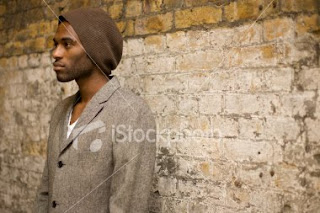
If we were to use an image with this layout with the tilt the writing would be featured on the side where their is the space.
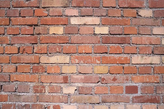
This image is a example to show what idea we have for the final background with the black font in the centre.
Digi Pak
FRONT:
For the front cover of our Digi Pak it will feature a photo of the artist leaning against a wall from one of the scenes in the music video, where he is walking down the street. Which gives it a clear link to the video and the music, it also shows the artist which is good for the demands of the record label. The title of the music video 'too famous to get fully dressed' will be structured above the image of the artist, in a white strip background in a bold black font, therefore the contrast will make it eye catching. The use of the image will give the cover a colourful main feature so the cover is intriguing compared to being a simple black and white cover.
BACK:
The back cover idea is that the main background is a plain brick wall with the simple contrast of bold black writing of the tracks down the centre, which also includes the music video as a special feature.
SPECIAL FEATURES:
To bring out the idea of the special feature, which is to fit in with the use of the Digi Pak's for special feature CD's, there will be some kind of label on the front of the Digi Pak to bring out the speciality.
Incident
We had an incident with out media footage, in which our media video work had been saved as a copy into another groups folder. Fortunately we were able to rectify the problem and have been able to re-save and work on the project from where we left off.
Editing
Me and Lily did some editing for the beginning of the music video, cutting clips from the footage we have taken and putting it together in an order that works with the song. It has been difficult for us to stick to our orginal idea, due to weather conditions and not being allowed to take equipment outside to film, so we have had to create new ideas, (i.e. the music room for a band performance, instead of a field, and when it was raining we shot a 'party' scene inside a house so we wouldnt be wasting our booked filming time), but we do include band shots and scenes of the artist walking down different streets/pathways as we had preiously planned to do.
Charlie looked over the work and added to the video, suggesting what we should change, for example, cutting more of the clips quicker to add in more of a variety of clips at a faster pace so the video is more interesting and the viewer does not loose interest.
We plan to finish off the rough cut next lesson.
Charlie looked over the work and added to the video, suggesting what we should change, for example, cutting more of the clips quicker to add in more of a variety of clips at a faster pace so the video is more interesting and the viewer does not loose interest.
We plan to finish off the rough cut next lesson.